RESPONSIBILITIES
• Meetings with stakeholders + group meeting with current students during discovery on-campus.
• Unmoderated Faculty survey in Qualtrics.com
• UI design in sketch, prototype in Invision.
• Remote presentations on Zoom
• Handoff / Content migration in collaboration with internal team.
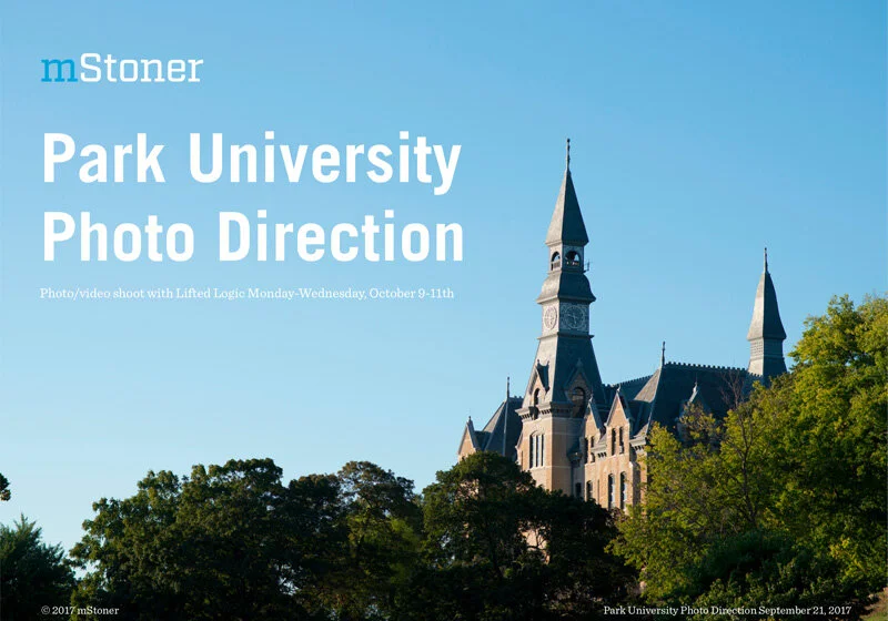
• Photo direction as pdf deliverable.
The goal of the comprehensive redesign project was to transform and elevate the Park.edu website into a worthy first touch-point to potential students looking to further their education with a well-respected university. The website should serve to communicate the mission and vision of Park University, state Undergraduate and Graduate academic programs available, and easily display campus locations including online, link to community and supporters important to the Park University experience such as Alumni and athletics and act as a resource for other Park University offerings.
On-campus group discussions
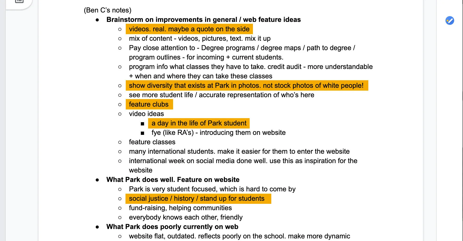
Brainstorm with current Park students surfaced some actionable ideas for the components on the homepage and beyond. Highlighted portions (below) from the notes informed much of the homepage layout. The on-campus visit was extremely informative in our quest to uncover the true character of the institution and present an accurate representation to prospective students and the world.
Faculty Survey
Remote unmoderated survey for staff and faculty members in Qualtrics.com.
• Easily accessible program/degree info in one location: tuition, requirements, Forms, contact information.
• Audience-specific info for Military/Vets, New students/Current students
Although the website must serve numerous audiences, the most important is prospective students looking for info on Park University.
Program pages
• Descriptions, courses, degree maps rated as most important Program page content.
• Access to student blog, faculty bios, and social media rated highly as well.
Homepage
• Academic info, search and ‘About’ deemed the highest priority.
• Request Info, apply, student life trailing right behind those top priority items.
Gathering brand assets
Color palette, Existing web fonts, Google font alternatives
Early Designs
Spent a day or two putting down work in sketch, bringing to life the most important concepts and strategic points we heard on campus / from the survey and shaping up visual brand assets and bringing into a cohesive and modern design.
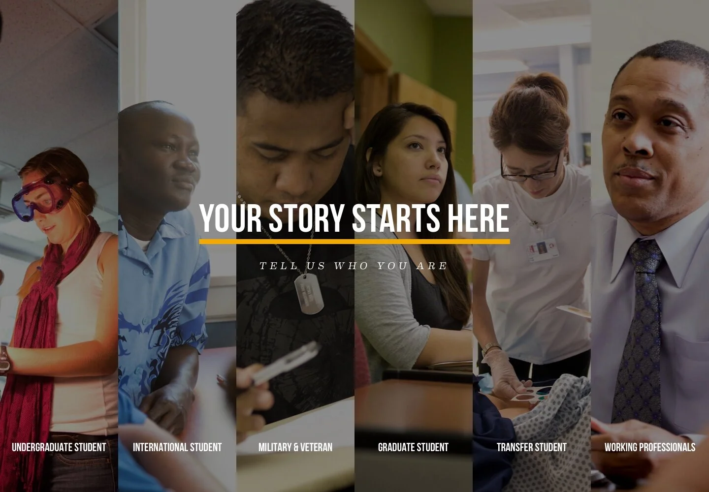
Authentic stories from real students and alumni (top). Audience Gateway (bottom).
Beginning to explore the idea of a campus locator for their many many campus centers.
Collage style layout featuring photos of real students using facilities / on campus, infographics, and student quotes.
Design & Collaboration
At this time I had a vacation planned and handed off my sketch file to another designer - she added some great stuff to the design and when I came back from vacation I picked it back up. An unusual process for us but it worked well and we got to a really layered and rich design, which hit all the strategic points we had uncovered with our sessions and faculty survey.
Design preference test
We tested our design against another direction and it was the preferred direction (left). On the right hand side is a picture of us getting old-school and using some physical media to map out our new design based on preference testing and additional input from the client.
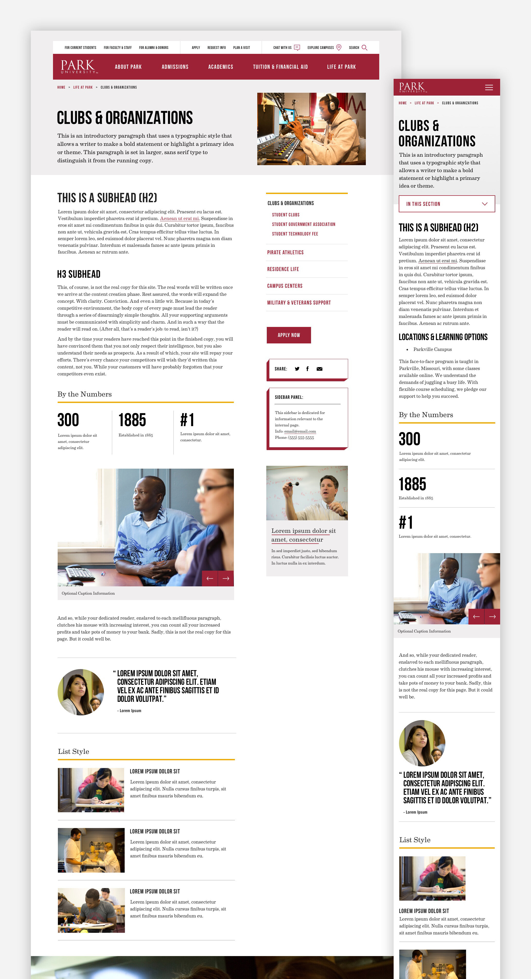
Finalized design + design system
Handoff to HTML & Content Migration
Annotated handoff slides with examples of motion and transition times, hover states, and variances for screen sizes. Give developers what they need without going overboard. In addition to providing handoff slides, there’s a Google Doc with links to SVGs, Sketch file, Invision set(s), relevant type foundrys, global elements like footer and header, and any additional notes on components, functionality, animation, or any additional considerations or background info as the project evolves. For this project I was part of the content migration process which was an added bonus because we caught some things we hadn’t planned for in design and we were able to address in design/markup before launch.
Photo guide
A major part of this project was getting the Park University website away from lazy, flat stock photography in order to capture student life, diversity, facilities and academics around campus. This document was the anti-stock photography manifesto, with directives on what to capture, lighting, composition and more.
Results
Did the new site meet Park University’s goal of increasing inquiries? Absolutely.
Inquiries via the website increased 17% in a year-over-year comparison of March to February.
Applications via the website increased 13% in a year-over-year comparison of March to February.
