Elmhurst University
www.elmhurst.edu
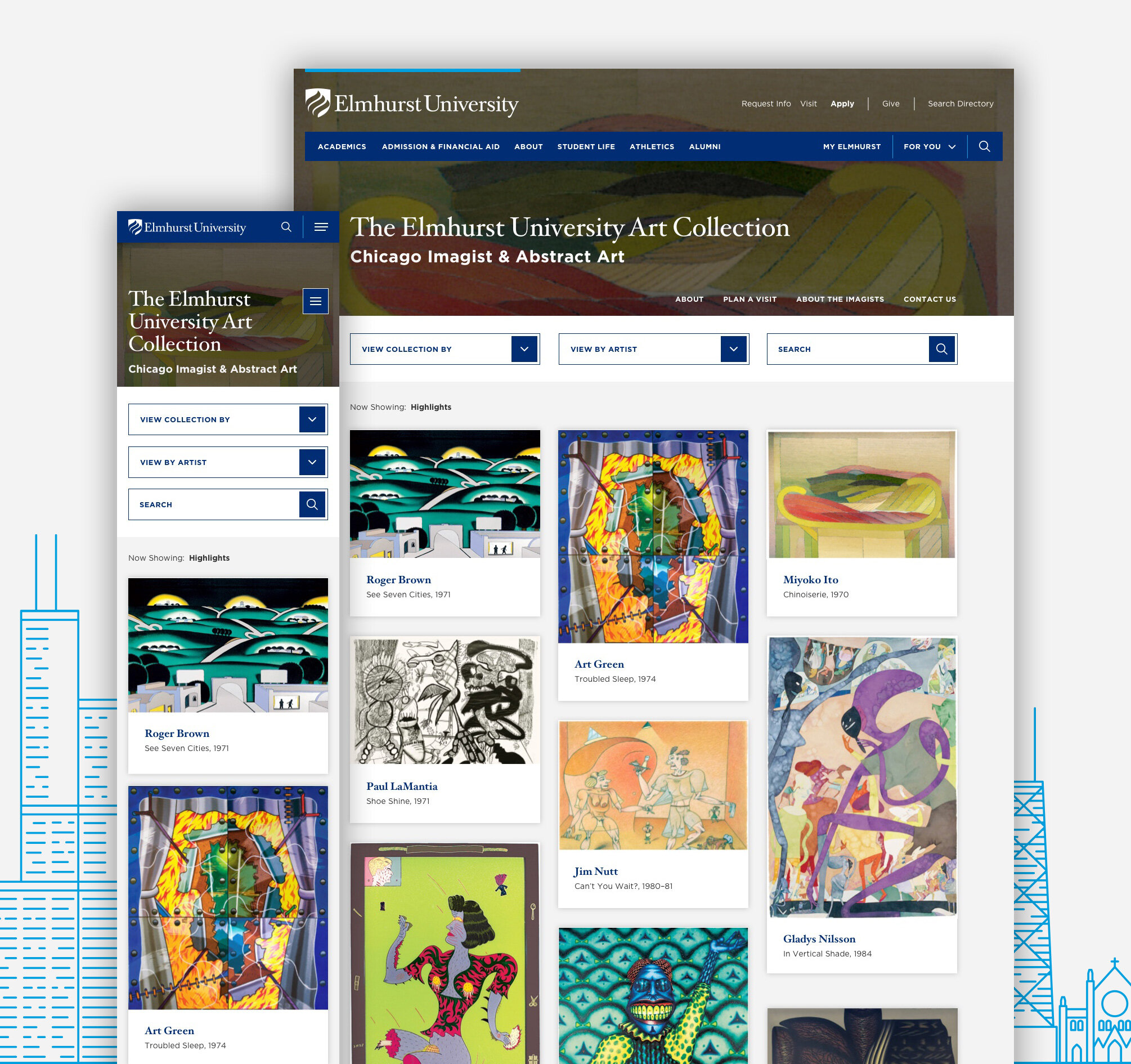
I had the pleasure of working with the Elmhurst University team on various phases of their website from site audits, blog post illustrations, to the most recent redesign of their homepage which coincided with the change from Elmhurst College to Elmhurst University.
Site checkup
Site audits are a quick and cost-effective way for institutions to get moving on the process of a website redesign and often the first touch-point in their relationship with us. We at mStoner provide a low-cost analysis of the current-state of their web presence as well as near and long-term plans for improvement. This allows higher-ed marketing managers to hand off a deliverable that shows a concrete way forward while also giving a preview of what it’s like to work with mStoner as their partner. I owned the design and ux related slides.
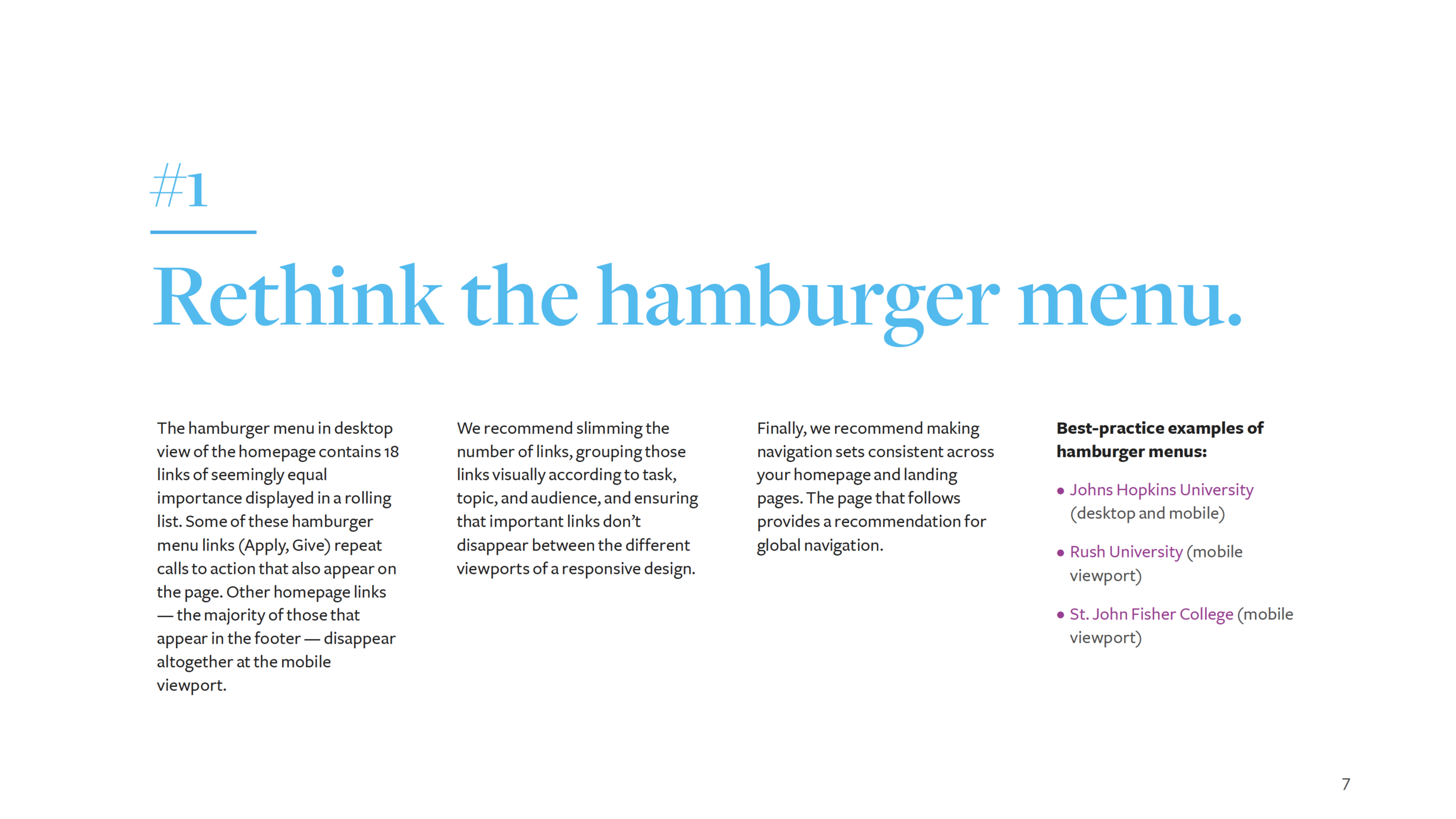
Organize links according to category, slim down number of links, avoid repetition, and prioritize. Keep consistent across all devices.
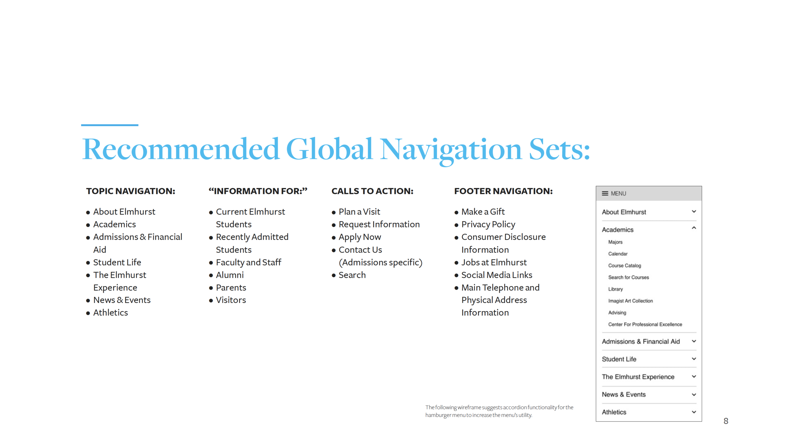

Use the hero space for high-impact imagery/video to instill a sense of place and inspire prospective students.

Use consistent and clearly defined header and paragraph styles to help your users navigate your pages and understand what’s important. Break up densely packed text with headlines, captions, stylized text, and images.

Ditch the current style of photography (White or plain backgrounds), capture the energy on campus and tell your story with editorial & environmental photography.

The site should employ clear functionality markers in it’s user interface. Three main areas of concern: Hyperlink styles, Iconography, Button styles.
Mini site audit (2019)
Using Google Analytics and Crazy Egg heat maps, we took another look at the site we redesigned in 2017 and suggested a few tweaks.
Insight / Recommendation #1
Scrolling, heat map, and analytics data showed us that users who were going to ‘Undergraduate Programs’ page (the #1 page off of the Homepage) were, in fact, looking for something they weren’t finding: a list of Undergraduate Programs, which lived on the ‘Undergraduate Majors & Minors’ page. Our recommendation was to ditch the hurdle for finding Undergraduate programs, treat both Undergraduate & Graduate Program pages the same, AND make both pages more engaging and informative by changing lists of hyperlinks to an interactive program finder which showed appropriate programs.

Heat map shows users clicking on the numerous links to get to programs (which they thought would be here). The fact that there were multiple routing links to a list of Undergraduate Programs suggests they found a work-around to a known issue.

Insight / Recommendation #2
3 types of pages were revealed in our review:
• Pages where users were browsing/exploring (Homepage, About).
• Routing pages - users were trying to get somewhere else.
• Destination pages - users had arrived at their desired destination (Academic Programs, Financial Aid, and Housing Information, News & Article pages).
Our recommendations:
• Pages where users are exploring what Elmhurst has to offer are great places to showcase student-focused story telling and key takeaways related to outcomes, financial aid, and academics.
• Routing pages are not good places for components other than routing. Users are not scrolling or engaging with content lower on the page. There is an opportunity here to design something more engaging and effective than what they’re currently doing on these pages for more effective and user-friendly routing.
• Identifying pages as destination pages helps de-emphasize storytelling and routing components and prioritize deeper information.

Insight / Recommendation #3
Our final recommendation was to move the Elmhurst Blog, a newer and quite active addition on the site, where users can find it: on the homepage, rather than under the About page in the IA, where many weren’t finding it.